
2025 USASP Logo Contest
Logo contest submissions can now be viewed below. We invite you to explore the designs and vote for your favorites using the button above.
Voting is only open to USASP Members. The deadline to vote is Friday, November 7th, 2025.
Logo Contest Finalists
Voting Deadline is Friday, November 7th, 2025

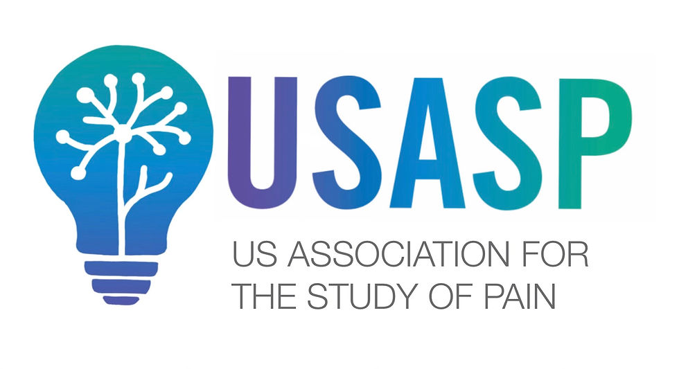
Finalist #1
This design takes the form of a lightbulb, symbolizing innovation and discovery, with branching structures inspired by the form of a neuron, a nod to the neural mechanisms underlying pain and the sensory pathways involved. These neuron-like branches also represent the diverse, interconnected members of USASP, whose collaborative efforts spark new ideas and drive progress in pain research. This logo captures both the complexity of pain and the collective vision of advancing science to improve the lives of those affected by it.

Finalist #2
This logo symbolizes the USASP’s commitment to advancing pain science through innovation and interdisciplinary collaboration. The human head represents the lived experience of pain and the scientific exploration of its neurological basis. The radiating lines in green, blue, and teal, emerging from a central node, evoke the spread of knowledge, collaboration, and discovery across diverse fields, working together to understand and alleviate pain.

Finalist #3
This logo features three abstract human figures emerging from a spherical connectome, symbolizing the integration of biological, psychological, and social aspects of pain. Their uplifted arms represent hope and empowerment through innovative breakthroughs in pain science. The connectome sphere reflects the organization’s commitment to collaboration and DEI by uniting people across varied disciplines, lived experiences, and geographies to advance the science of pain together.
.png)

#1
Mirroring the complexity of the nervous system, this logo features interconnected human-like forms that evoke both neurons and a collaborative community. It illustrates USASP’s commitment to multidisciplinary approaches that advance pain science and translate discoveries into meaningful relief. The design reflects our belief that progress in pain relief is driven by human connection, scientific innovation, and the integration of diverse perspectives.
#2
The USASP logo symbolizes the complexity of pain through a bold, outlined star—representing both the human experience and the organization’s national identity. The embedded acronym “USASP” reflects the society’s commitment to advancing the fight against pain. The star’s disintegration into smaller stars illustrates the fragmentation of pain and the diverse ways it manifests in individuals. These dispersing stars also represent the dissemination of knowledge, innovation, and hope through the society’s research, education, and advocacy.
#3
This design takes the form of a lightbulb, symbolizing innovation and discovery, with branching structures inspired by the form of a neuron, a nod to the neural mechanisms underlying pain and the sensory pathways involved. These neuron-like branches also represent the diverse, interconnected members of USASP, whose collaborative efforts spark new ideas and drive progress in pain research. This logo captures both the complexity of pain and the collective vision of advancing science to improve the lives of those affected by it.

.jpeg)

#4
This logo symbolizes the USASP’s commitment to advancing pain science through innovation and interdisciplinary collaboration. The human head represents the lived experience of pain and the scientific exploration of its neurological basis. The radiating lines in green, blue, and teal, emerging from a central node, evoke the spread of knowledge, collaboration, and discovery across diverse fields, working together to understand and alleviate pain.
#5
This logo blends symbols of science, healthcare, and knowledge to represent USASP’s mission to reduce the burden of pain through interdisciplinary collaboration. The open book symbolizes research, learning, and the continual pursuit of evidence-based pain science. The caduceus, arising from the center of the book, represents the healthcare community, including clinicians, policymakers, and caregivers working alongside scientists to translate research into compassionate care and equitable access to pain relief for all.
#6
The themes of the logo are connection (linked letters) and hope through the leaf motif which evokes emerging growth/progress. The font evokes a welcoming and accessible feeling Note that the color scheme is TBD and the designer would assist. This is just a super rough sketch of an idea.


#7
The logo was inspired by the USASP’s commitment to innovation, collaboration, and transforming the future of pain science. The circular emblem features a dynamic human figure in motion—abstract but unmistakable—emerging from interlocking shapes that suggest both scientific precision and human connection. The arc of the figure conveys forward movement and healing, reinforcing the motto “Move Beyond Pain".
#8
This logo represents aspiration, connectivity and support. The central "A" points upward to direct our thoughts to a higher plane. Its arms support the society and also the fact that the the "US" is on one side and "SP" is on the other symbolizes the connection between basic science research and clinical research and the balance needed for both.
#9
This logo features three abstract human figures emerging from a spherical connectome, symbolizing the integration of biological, psychological, and social aspects of pain. Their uplifted arms represent hope and empowerment through innovative breakthroughs in pain science. The connectome sphere reflects the organization’s commitment to collaboration and DEI by uniting people across varied disciplines, lived experiences, and geographies to advance the science of pain together.


#10
The USASP logo features a flowing, abstract ribbon forms the number 5, resembles both a treble clef and a spinal form, representing the harmony between science and the human body in understanding pain. The gradient blue-to-teal color palette conveys calm, healing, and professionalism. The tagline marks the organization's 5-year milestone, highlighting its continued dedication to pain research and advocacy.
#11
The figure in the middle contains a spine and nerves branching out showing the whole body aspect of pain. The surrounding halo represents the holistic and inclusive nature of USASP's mission while the pulse underneath is meant to evoke the scientific measurement of pain impulses. Finally, the figure is kept androgenous to represent any person of any description as pain does not discriminate.
#12
This logo tells a story of transformation: it features a stylized, upward-sweeping arrow that begins in a scattered cluster of fragmented, multi-sized dots and transitions into a unified, organized formation. The initial disarray symbolizes both the complex, multifactorial nature of pain and the diverse expertise of USASP’s members. As the elements converge, they reflect the power of collaboration, scientific rigor, and shared purpose – bringing more clarity and direction to a chaotic and challenging field of research. The arrow’s ascent represents optimism and progress, while the cosmic or “stars” overall theme underscores the vast, ambitious challenge USASP is tackling: unraveling the mysteries of pain to improve patients’ lives and reduce the burden of pain.
.png)
.png)
.png)
#13
Everything feeling in the body stems from the brain. Pain, love, grief, & joy. I think using the brain is the perfect way to address all areas of the USASP.
#14
A smooth, upward path flowing into the name USASP symbolizes progress, guidance, and commitment to advancing pain science.
#15
A vibrant, modern logo using intertwining letters and a neural network motif to represent the collaborative, science-driven mission of advancing pain research and relief.

.png)
#16
This logo not only contains all the colors given but also delivers the purpose of this organization. In this logo I have used a human graphic and a red spot showcasing pain this showcases the purpose this organization works on pain. Also that it is quiet simple yet lively.
#17
This design aims to parallel the IASP logo, with swirling gradient lines, reflecting the connection and collaboration between these two pain research organizations. At the heart of this design is a leaping figure, symbolizing hope for a future where the burden of pain is reduced and the quality of life for those living with pain is improved through the efforts of the pain research community.
#18
A clean, modern logo with a bold frame and gradient line symbolizing progress and connection in pain research.
.png)

#19
A soft, symmetrical design symbolizing empathy, unity, and the interconnected efforts of the pain research community.
#20
The USASP logo conveys a sense of professionalism, empathy, and trust through its clean design, balanced colors, and the prominent Rod of Asclepius. The bold lettering and structured layout reflect the organization's commitment to advancing pain research, education, and advocacy with integrity and compassion.
Annual Conference
Education
Membership
About USASP
